Data Exploration/Design
Over the last few months, I have been working with publicly available data from the Florida Department of Corrections and posting my work to a public repository. The visual submitted for this project evolved from an investigation I was already conducting on returns to incarceration within the Florida Department of Corrections.
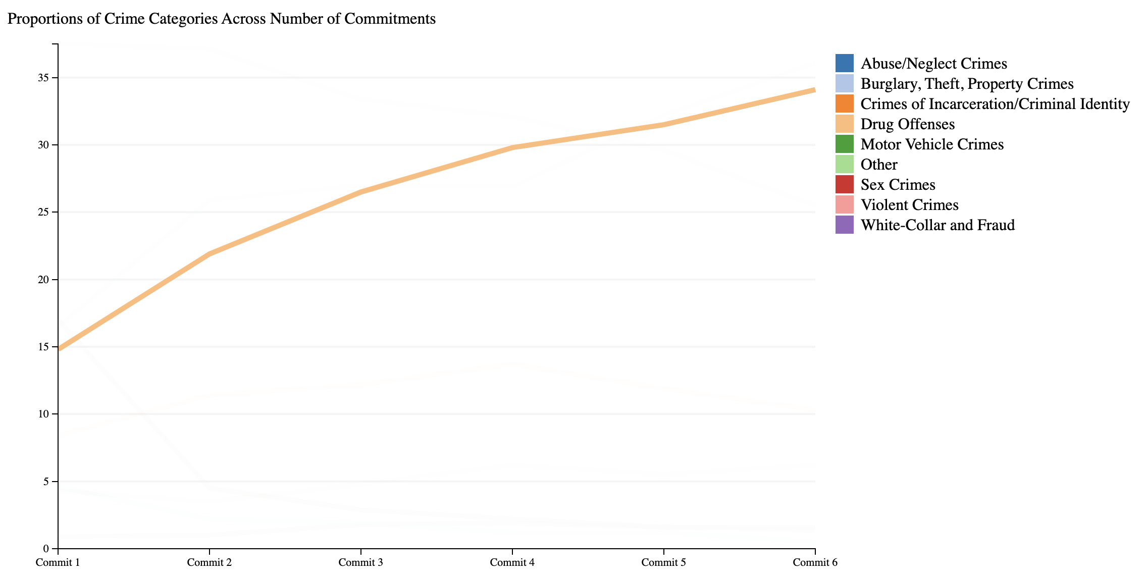
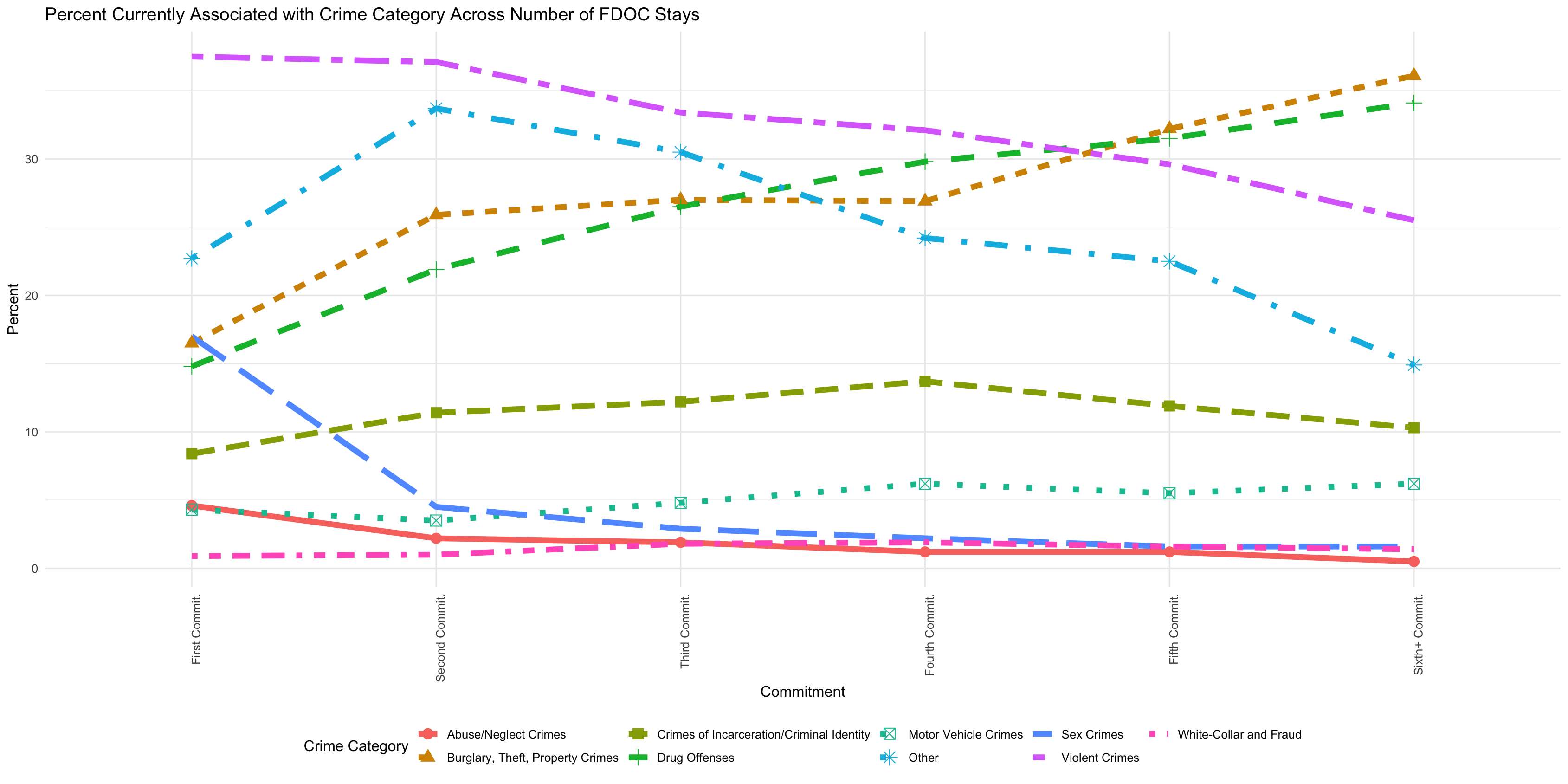
Previously, I had explored the question of, of those incarcerated for their first, second, third, etc, offense, how does the proportion of crime category change? We might then ask, for example, when looking at those who are in for violent offenses, does that proportion of the population grow or shrink among those in prison their first, second, third, times?
This initial investigation was conducted in R within RStudio, and required a substantial amount of data manipulation, but the design of the graphic closely followed the process of investigation with the raw data, so I will focus on describing my exploration.
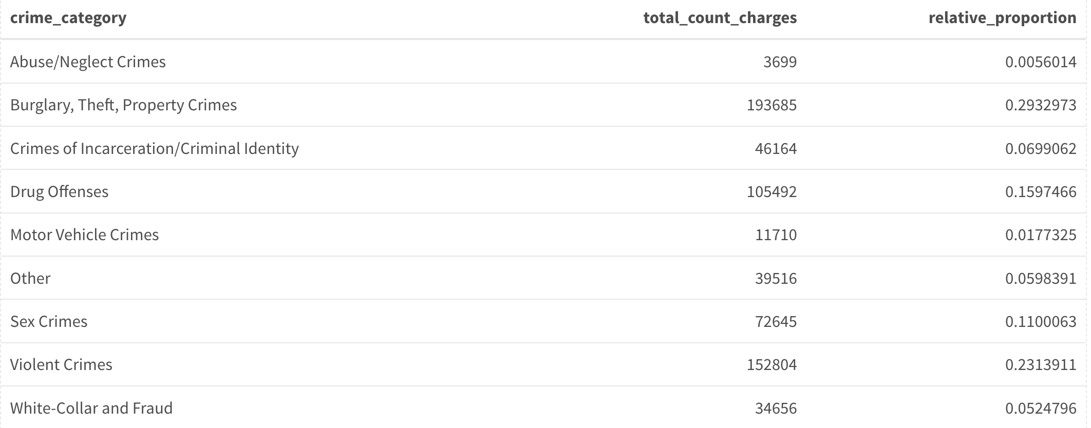
To begin, I just looked at the ordered proportions of crime categories for everyone incarcerated — this showed that the bulk were Burglary, Theft, Property Crimes, at 29% and Violent Crimes at 23%. There was then a steep drop with the third largest proportion coming in at Drug Offenses at 15%.
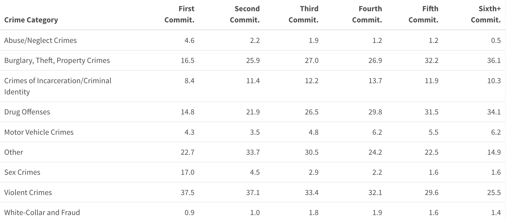
My next step involved isolating each group based on the number of times they were incarcerated. First, I specifically focused on those incarcerated for the first time to examine their proportions. Immediately, I noticed a significant difference from the total population proportions: the proportion of individuals associated with Burglary, Theft, and Property Crimes dropped to 16.5%, while those associated with violent crimes rose to 37.5%.
Although it didn’t make sense to juxtapose in a table the proportions for the general population and the subpopulation of those incarcerated for a specific number of times, it made great sense to tabulate the proportions of those subpopulations themselves.
I organized the data logically, with categories as rows and iterative filtering for each subgroup as columns — First Commitment, Second Commitment, and so on. These columns were arranged from left to right, with the number of commitments increasing in each column.
From here I recognized that I had a visualization already ready to go. All I needed to do was encode the proportion values as spatial distances, the categorical differences as colors and line types, and connect encoded points with lines to convey progression throughout increasing number of incarcerations.
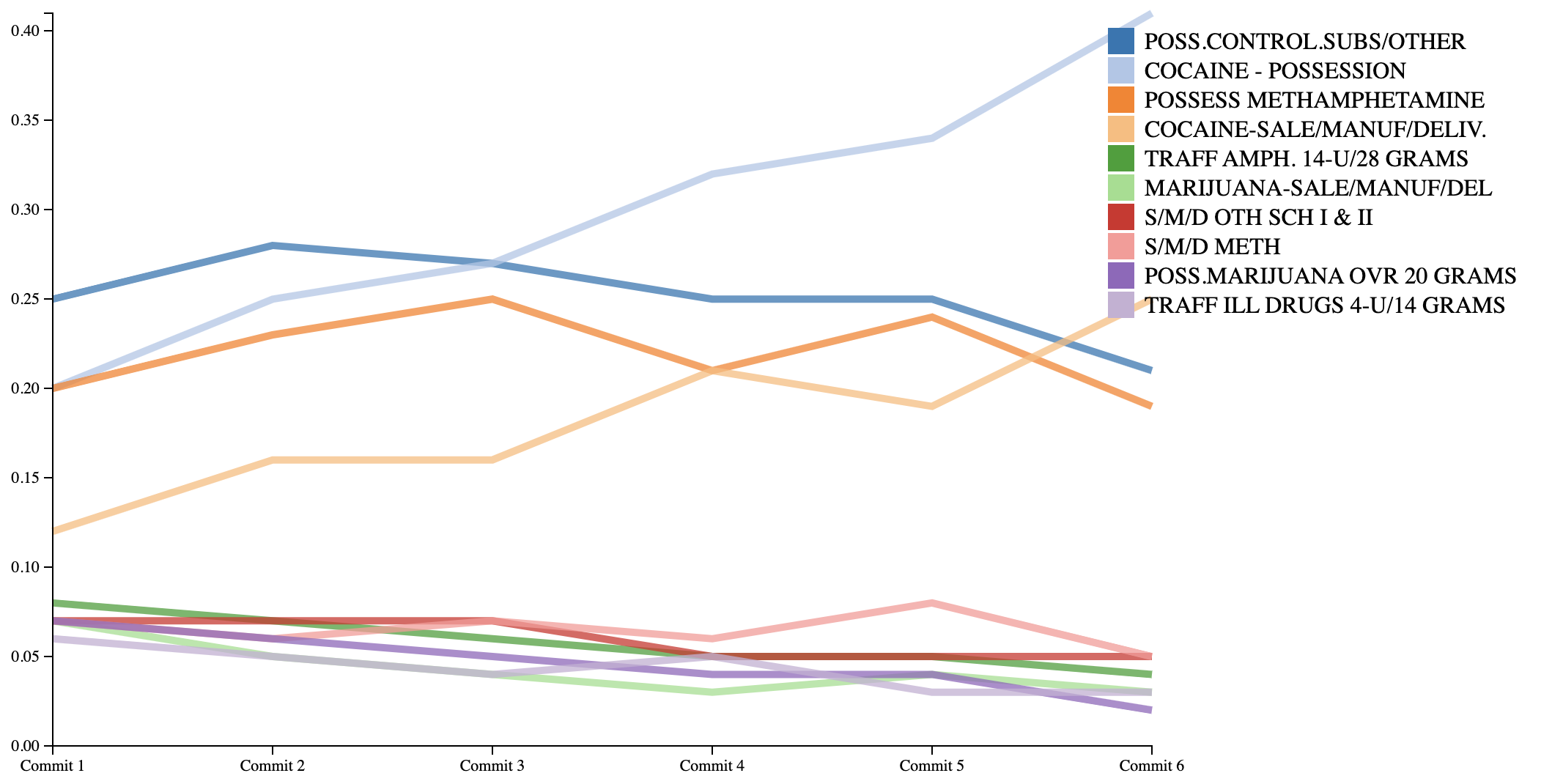
The static graphic had several disadvantages and limitations. The interactive visual aimed to address the two most significant issues. Firstly, the number of crime categories was larger than ideal for a clear graphic, resulting in some clutter. Secondly, it relied on aggregated information from categories, losing information on individual crimes.